02:00
Data Summary and Visualization
STA 101L - Summer I 2022
Franklin (albino) and Gillman have read the syllabus. Have you?

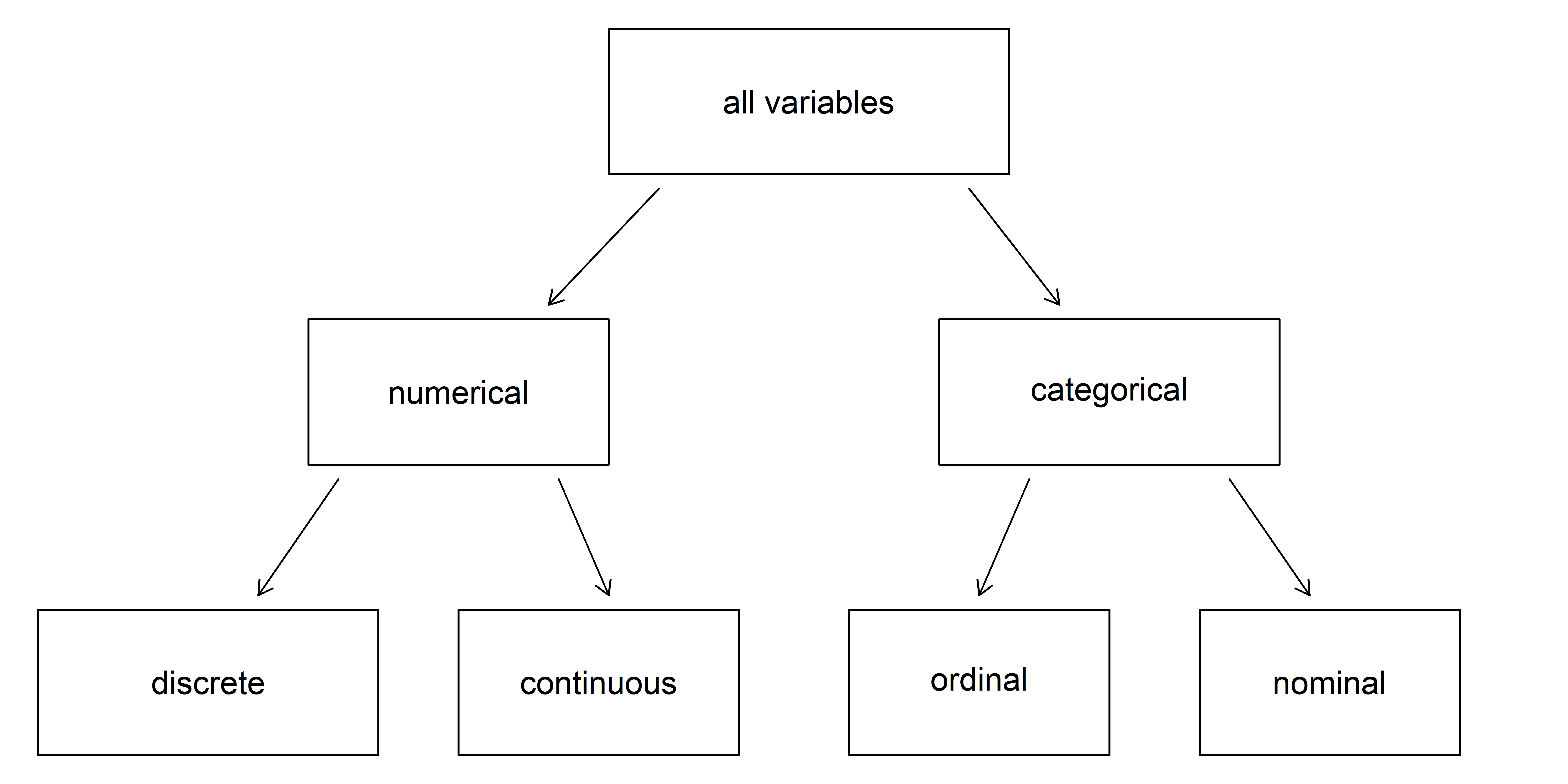
Breakdown of variables into their respective types.
Source: IMS
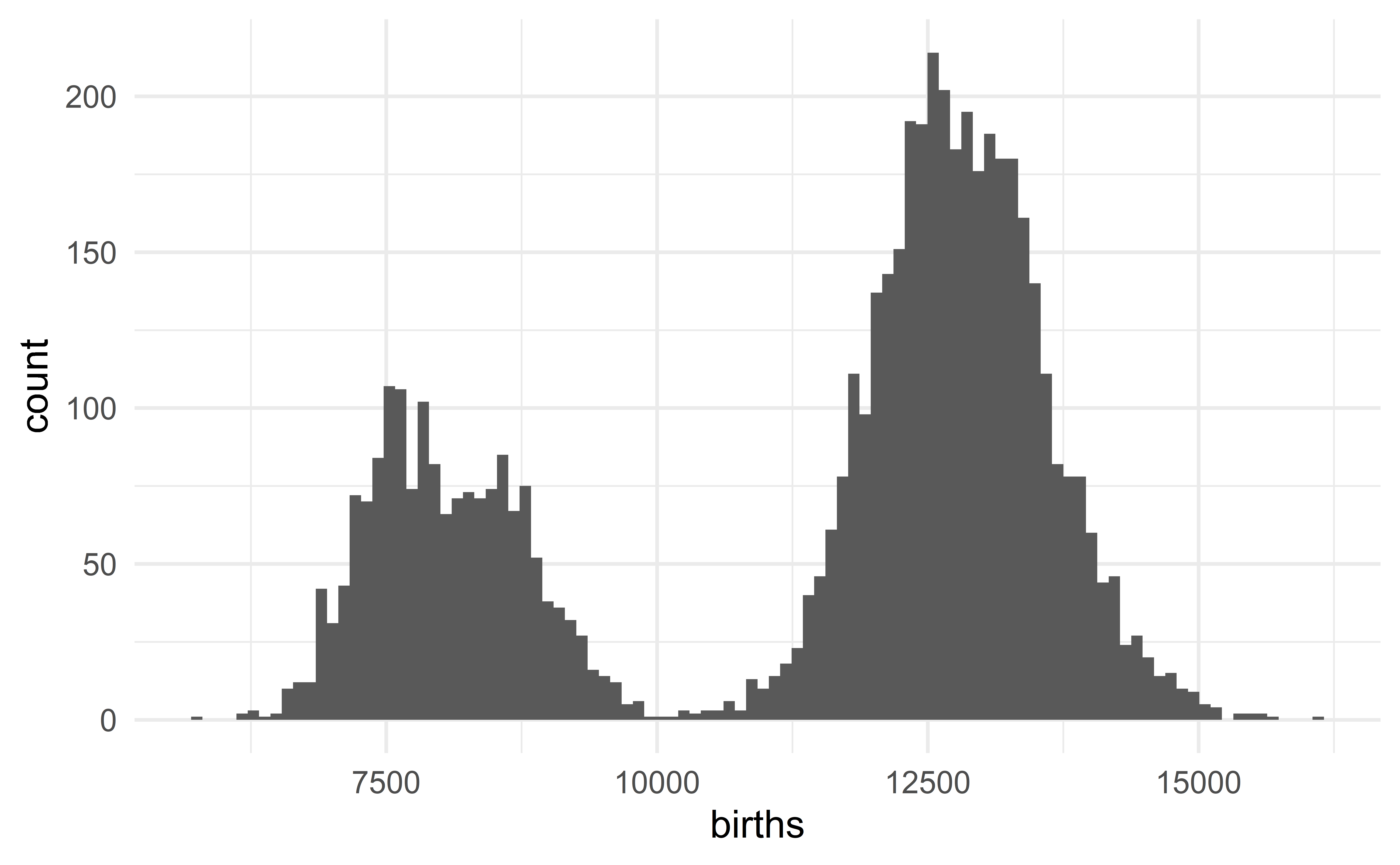
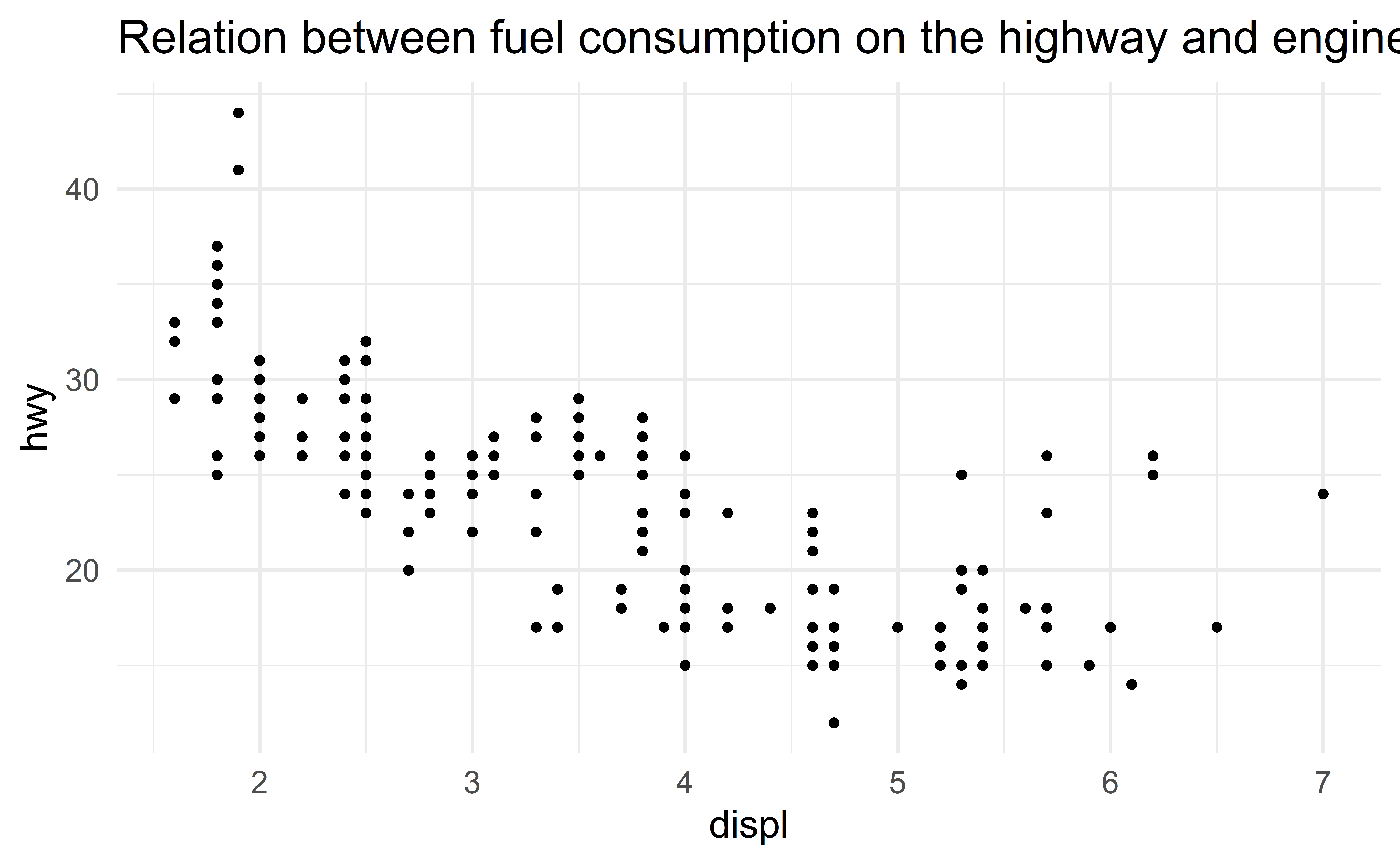
Histogram
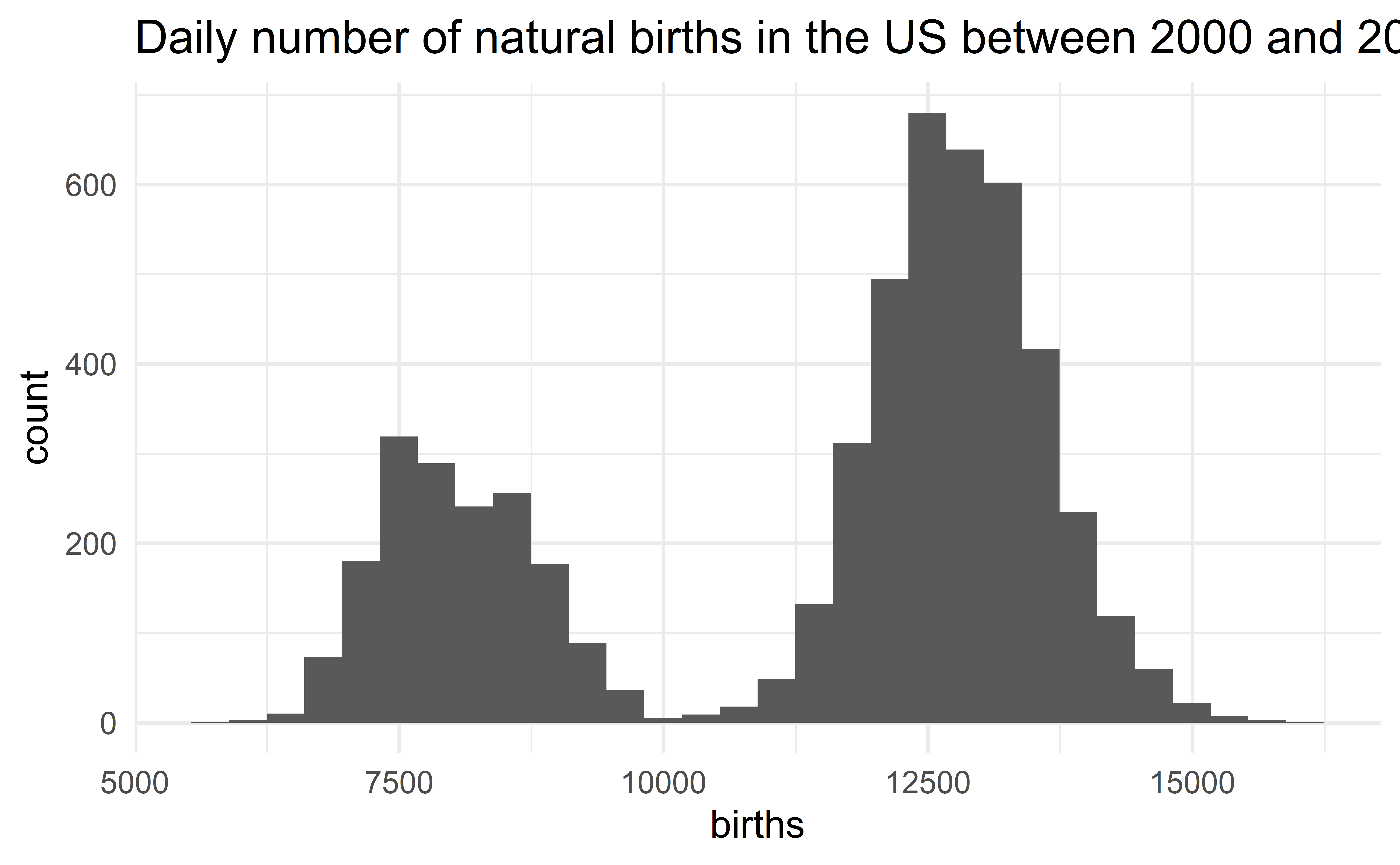
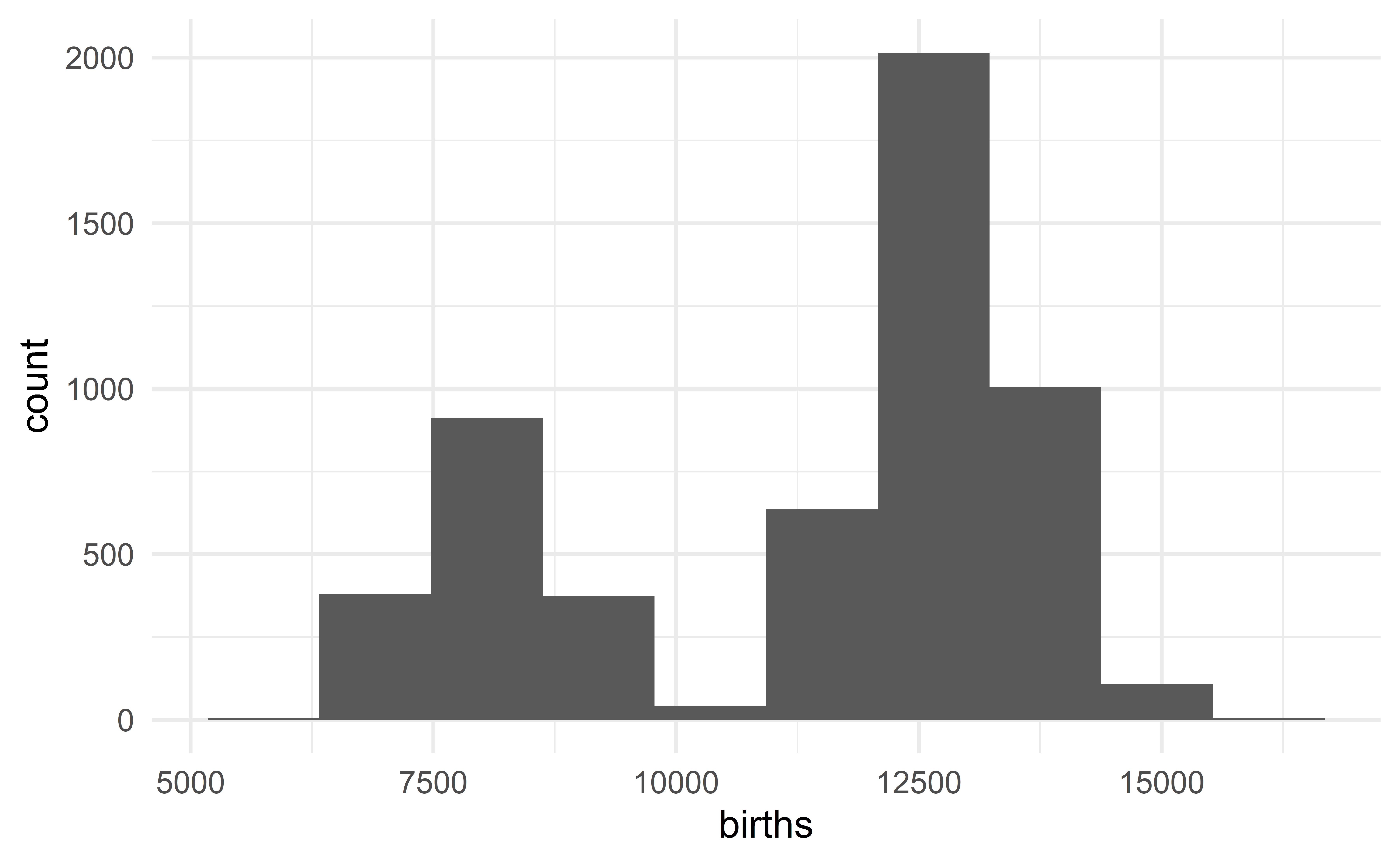

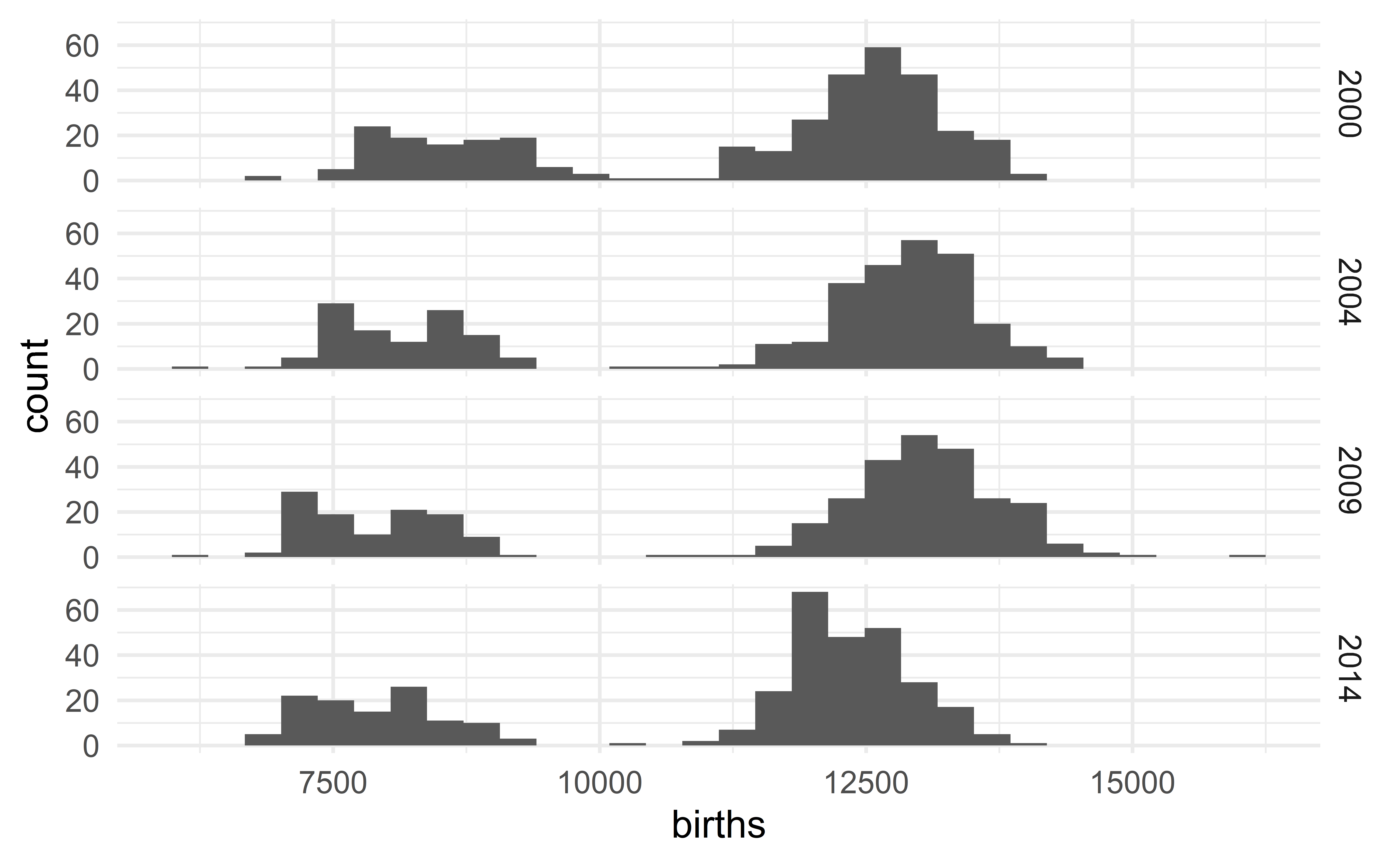
Describing the US birth data
The distribution of the daily number of births in the US is bimodal with each mode being bell-shaped and symmetric. We observe no extreme value.
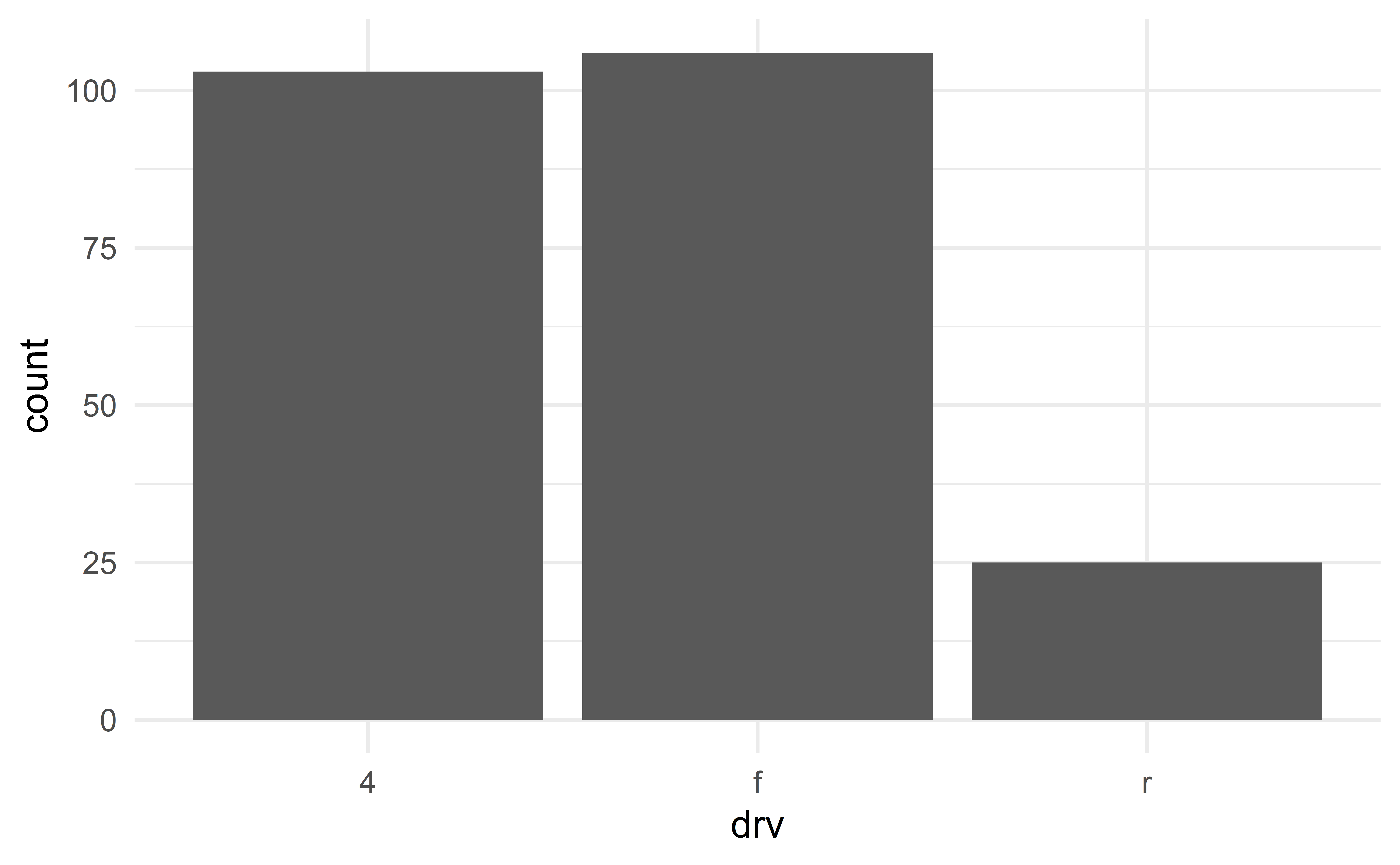
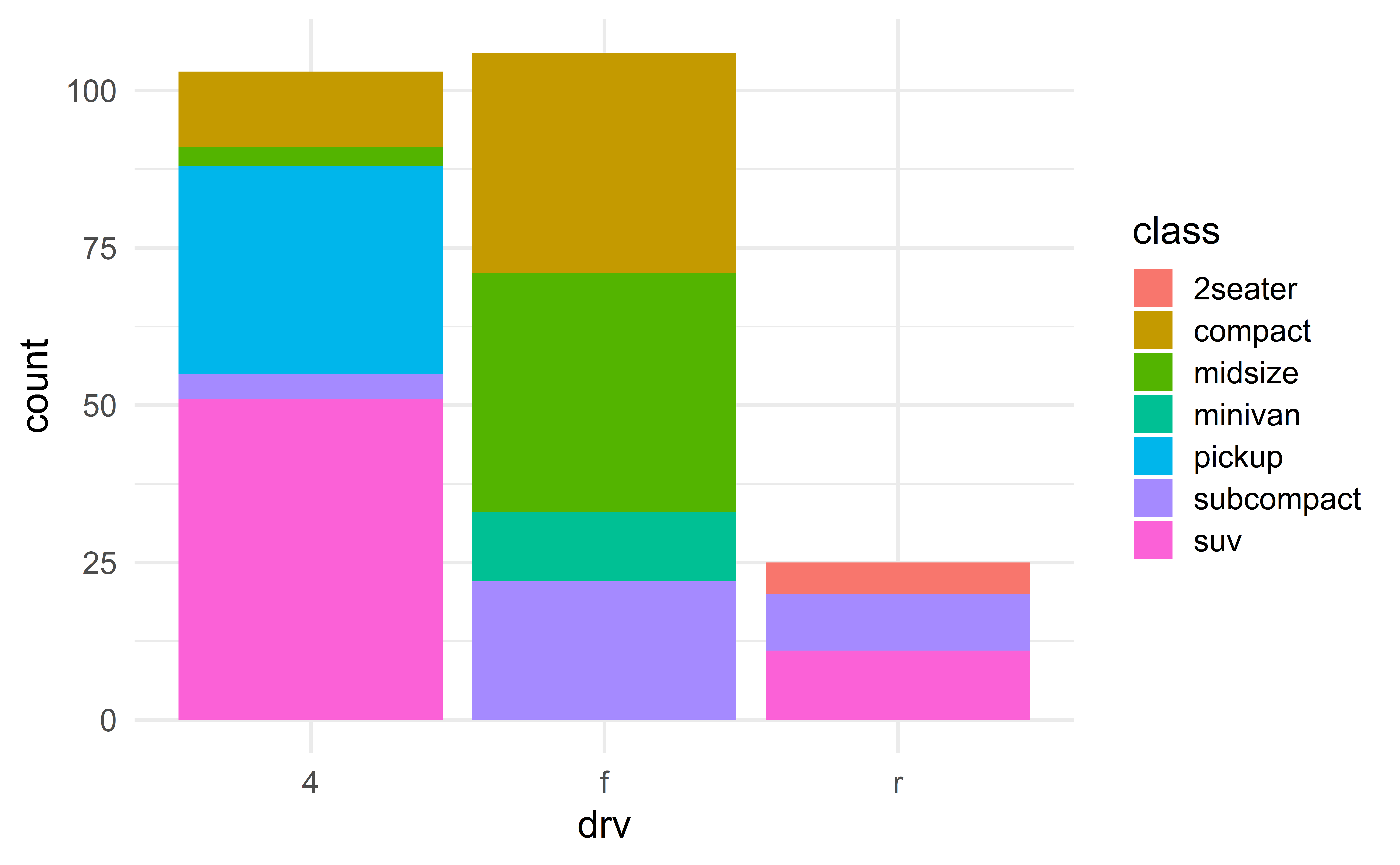
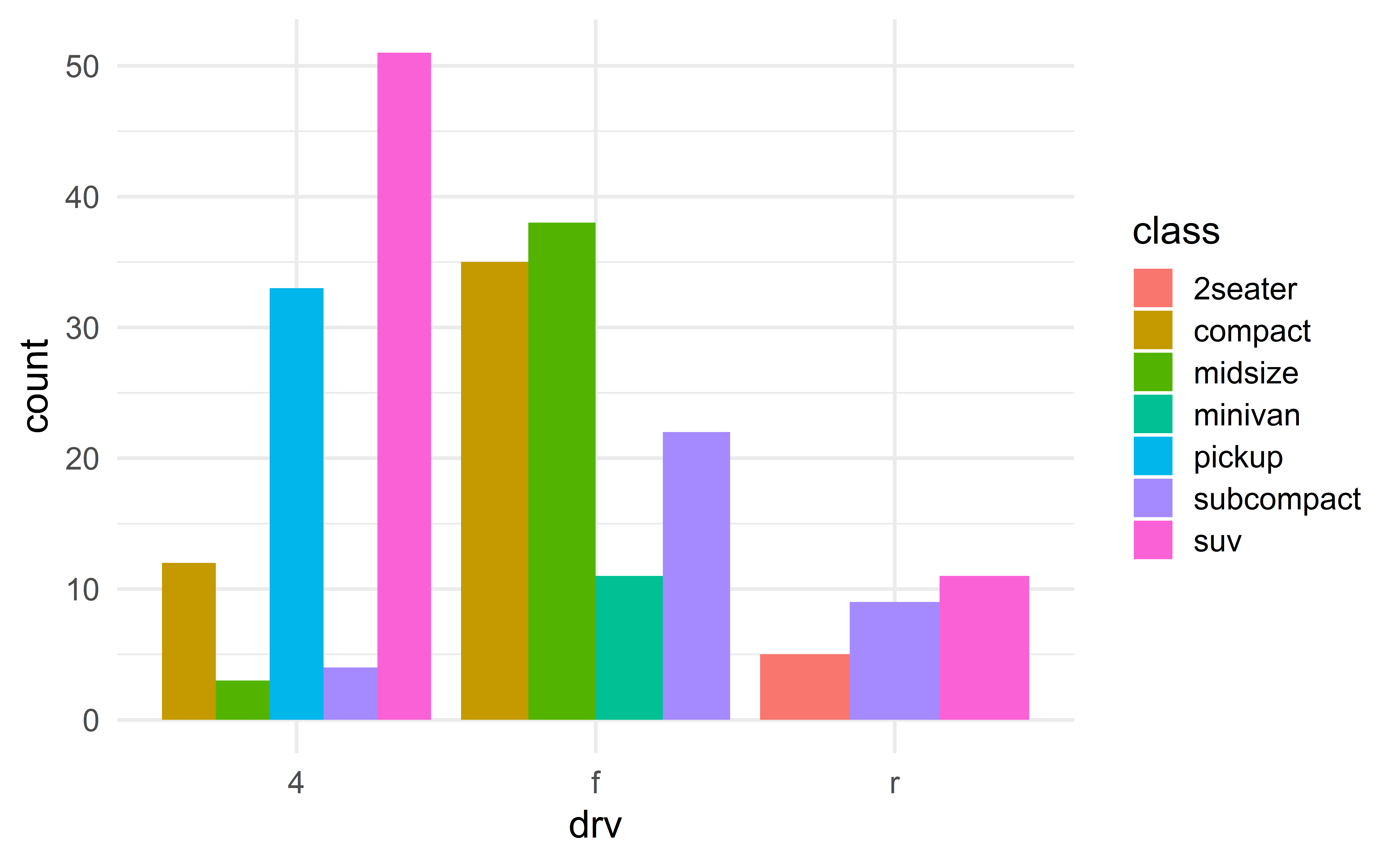
Barplot
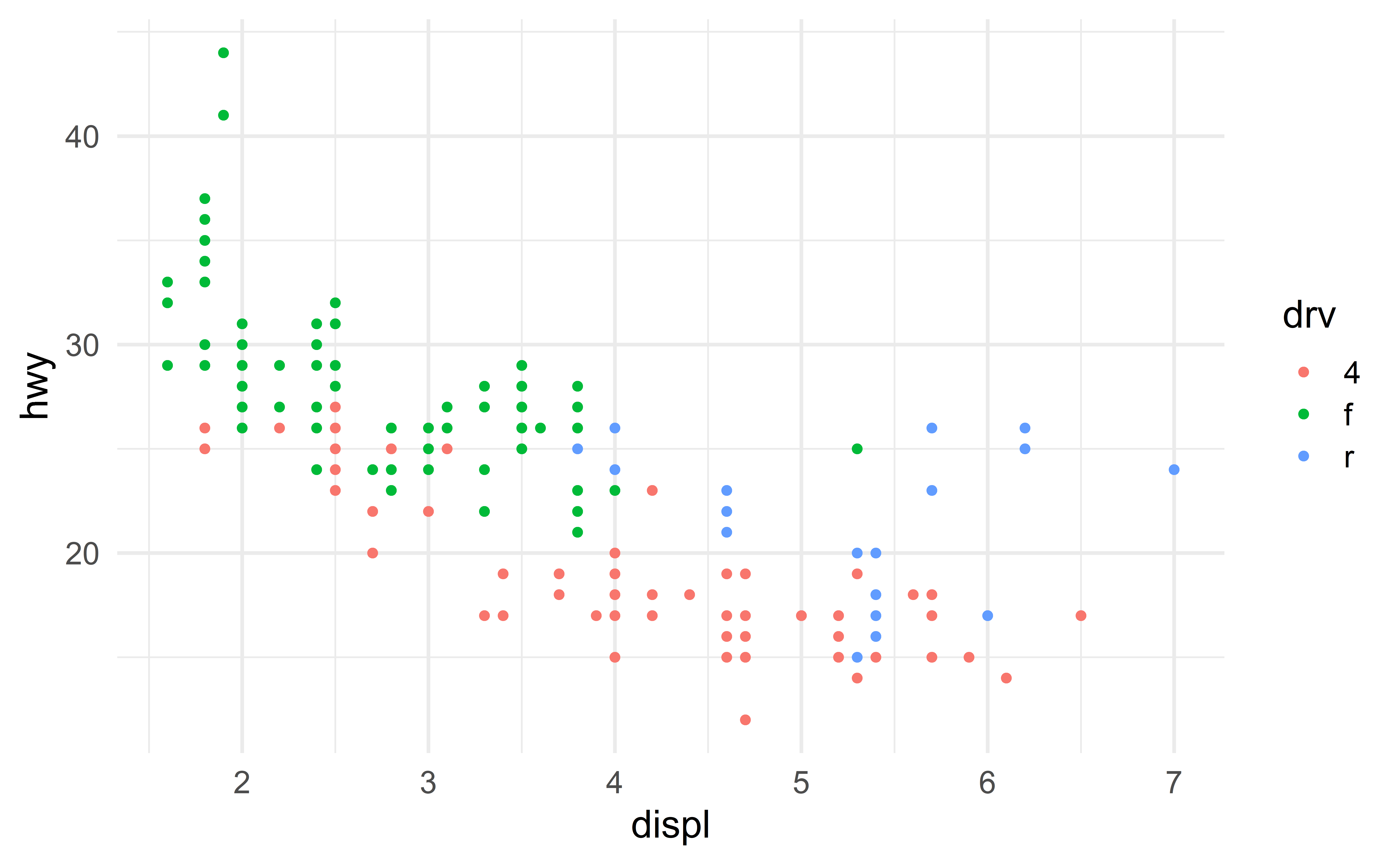
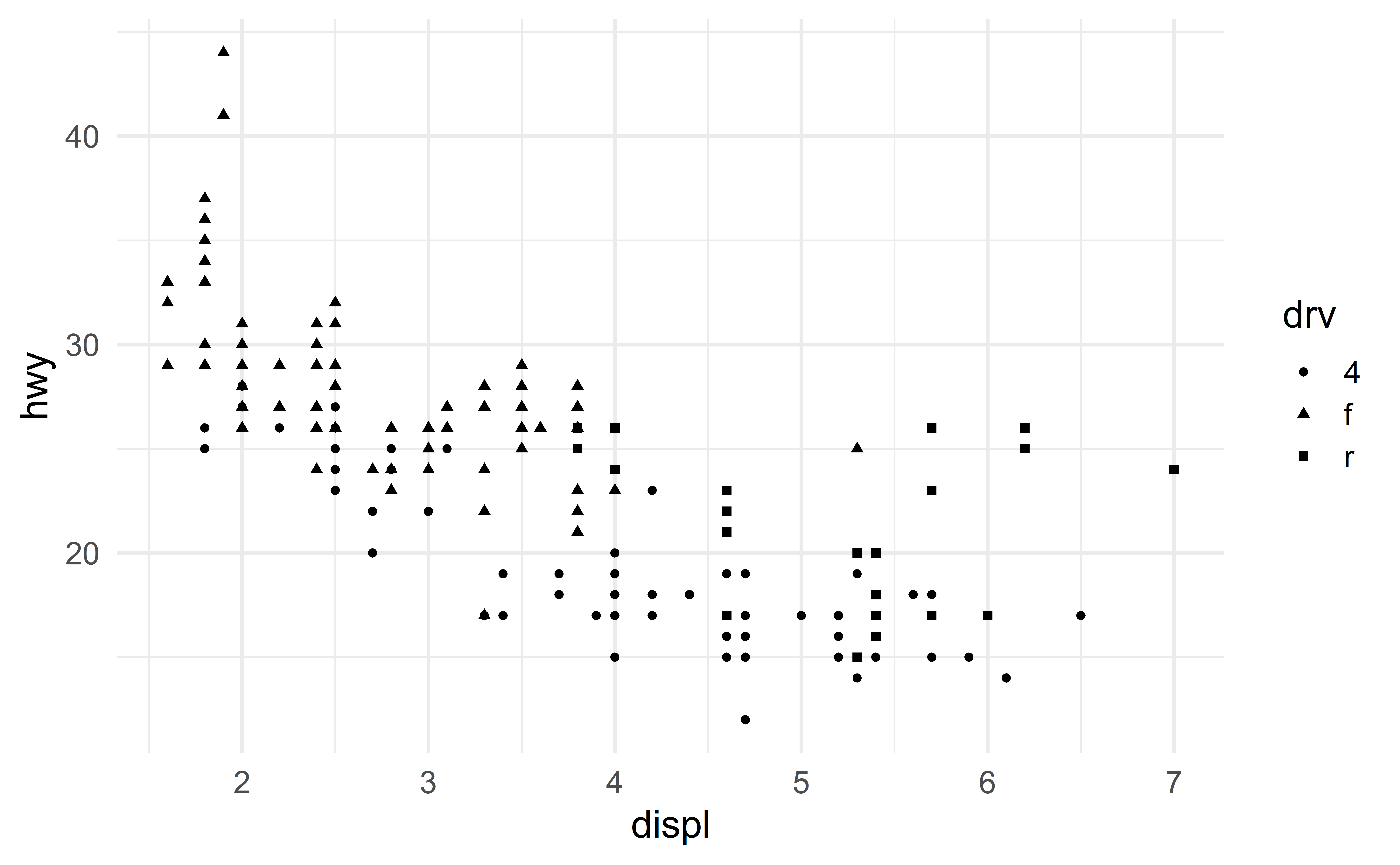
We can add a second categorical variable using colors.
Advanced barplots
Faceted histograms
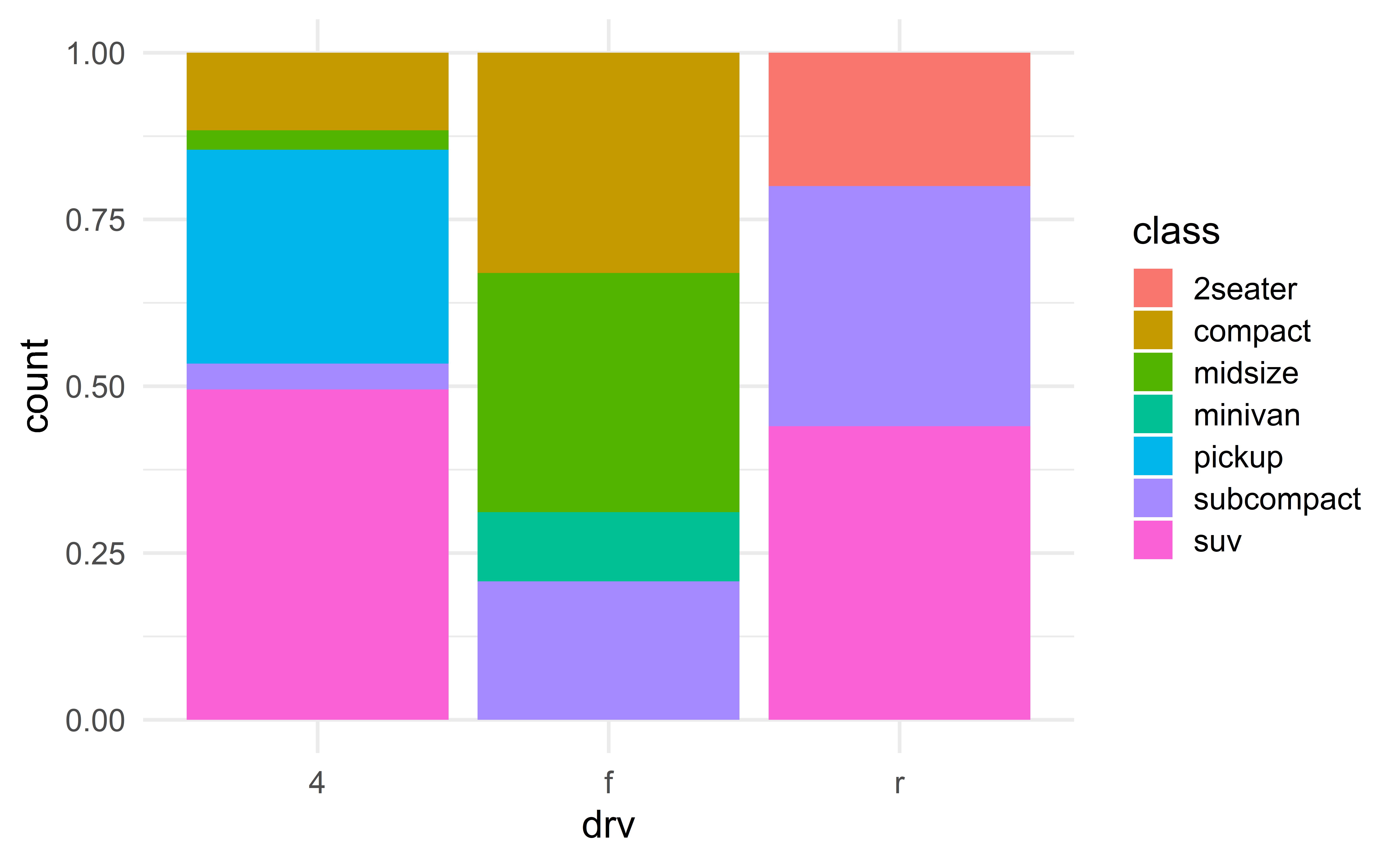
Mosaic plot
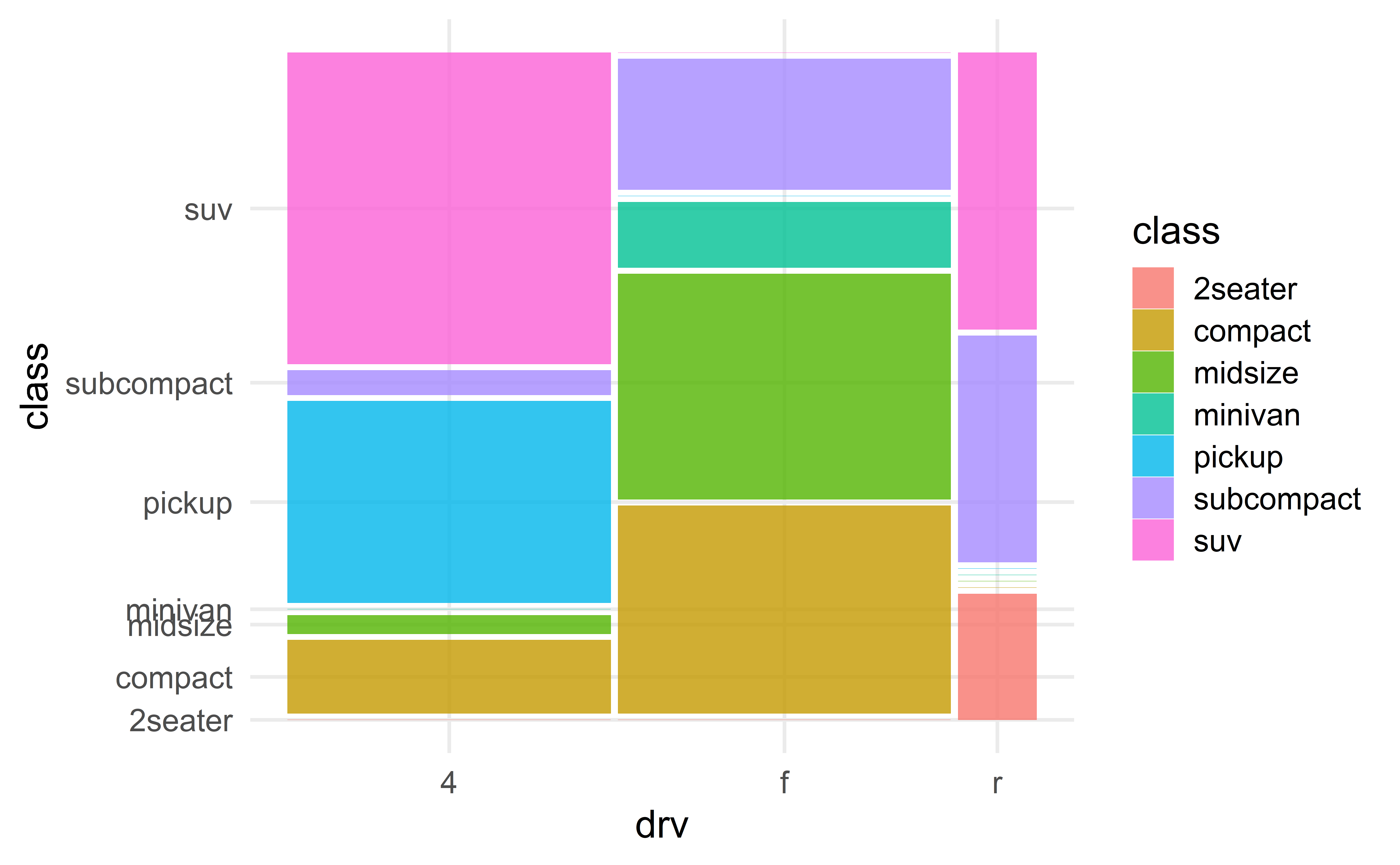
✅ Combines the strengths of the various barplots.
🛑 Not in the tool box of every data scientist
Boxplots
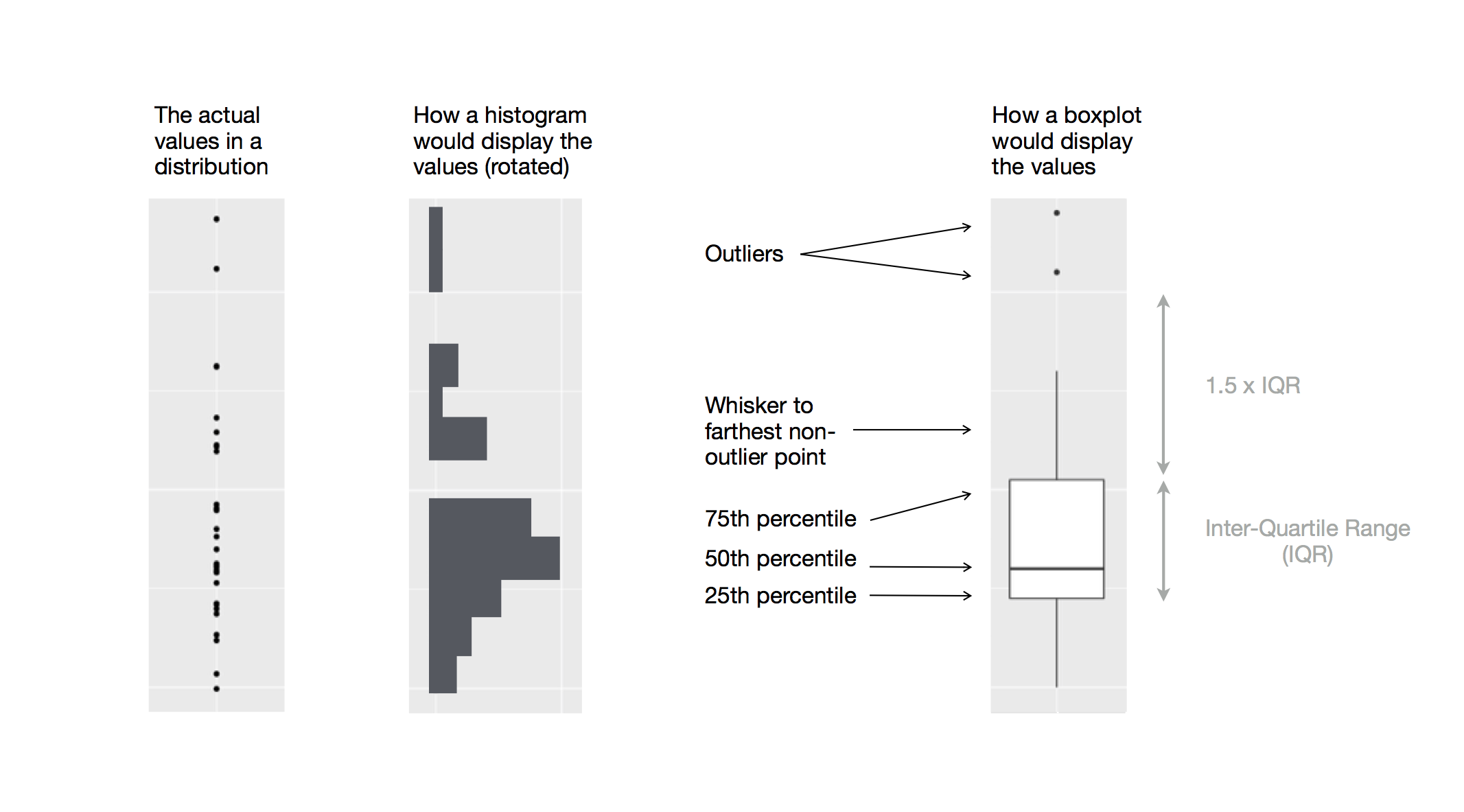
From raw data to boxplot
Source: R 4 Data Science
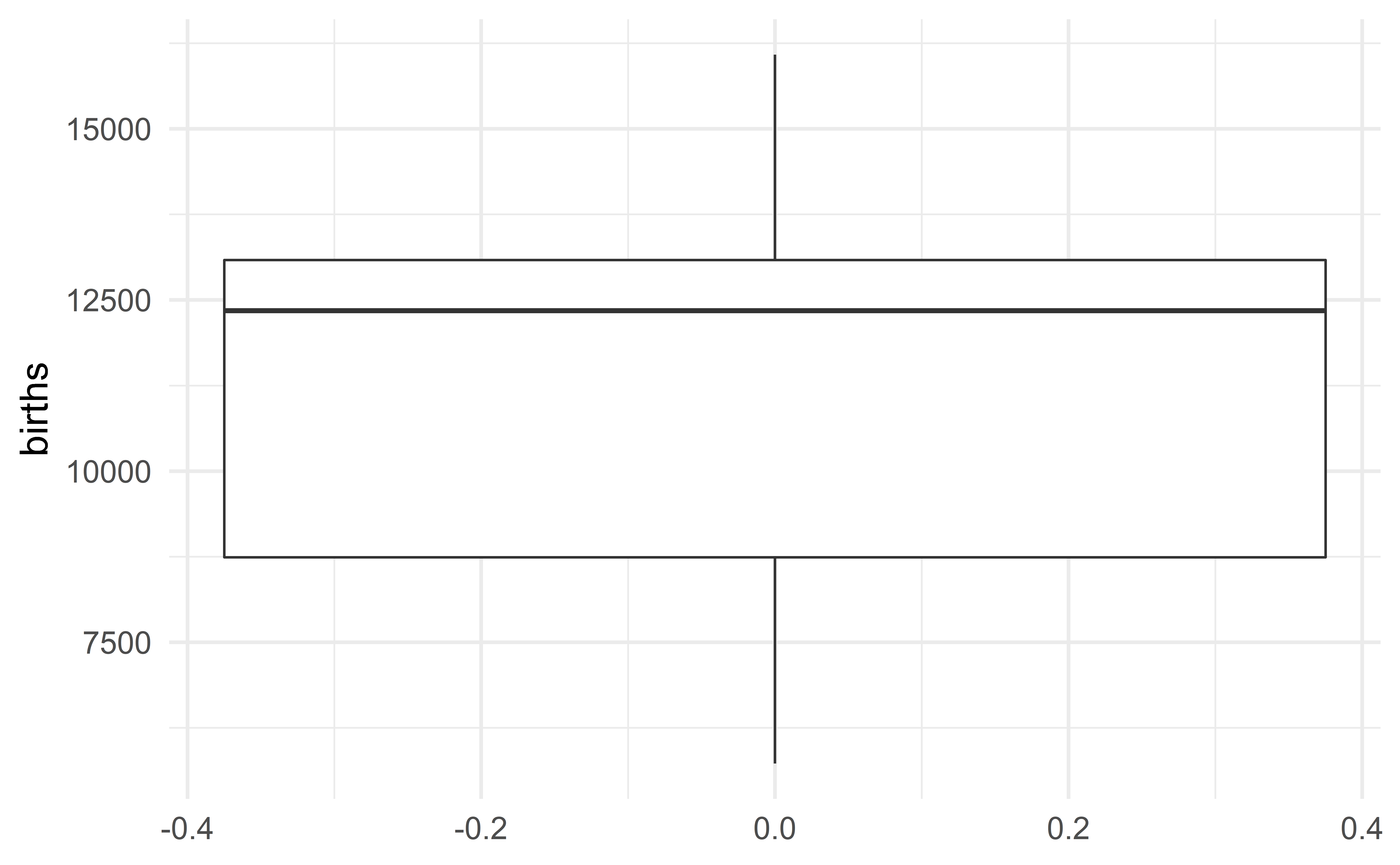
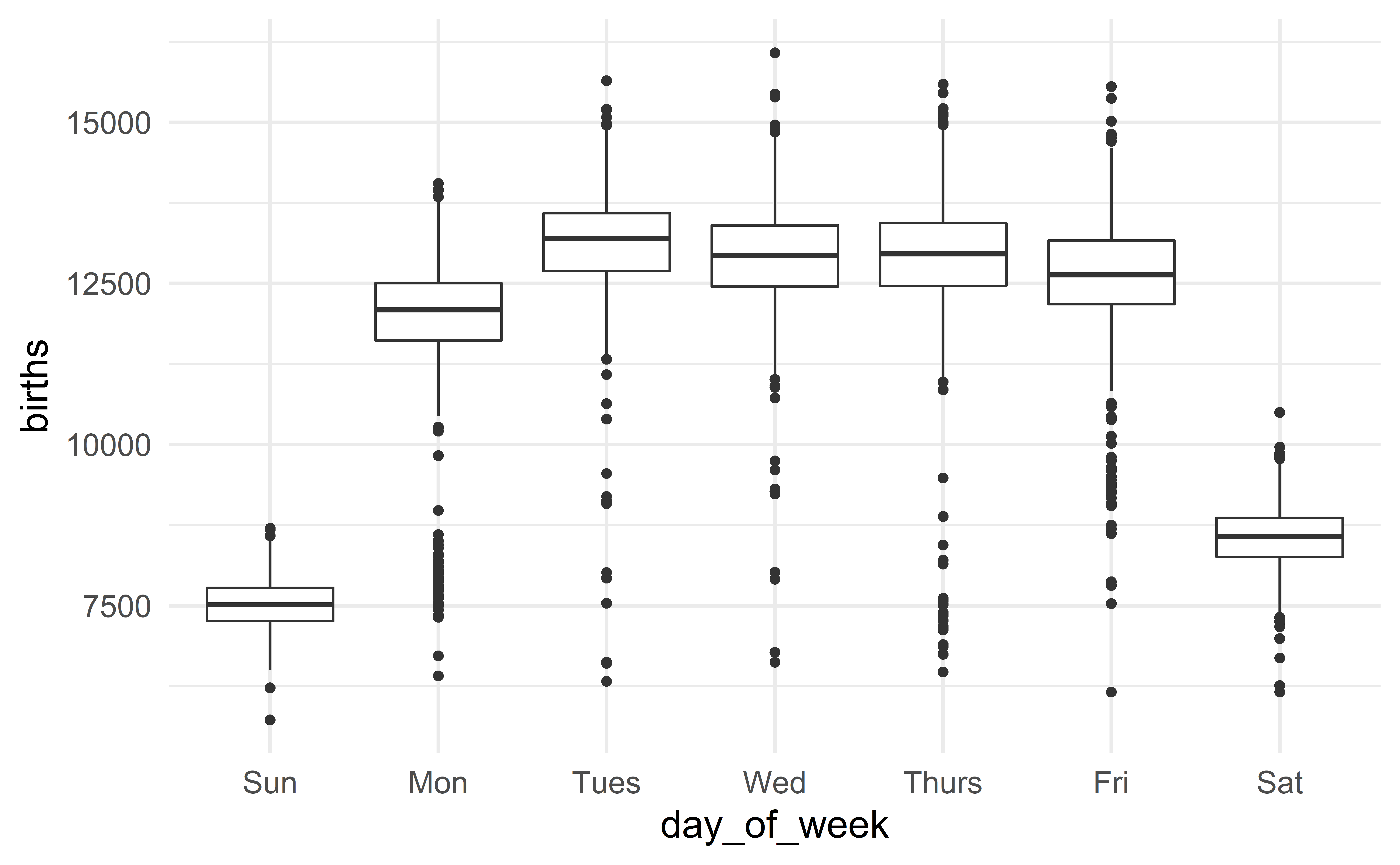
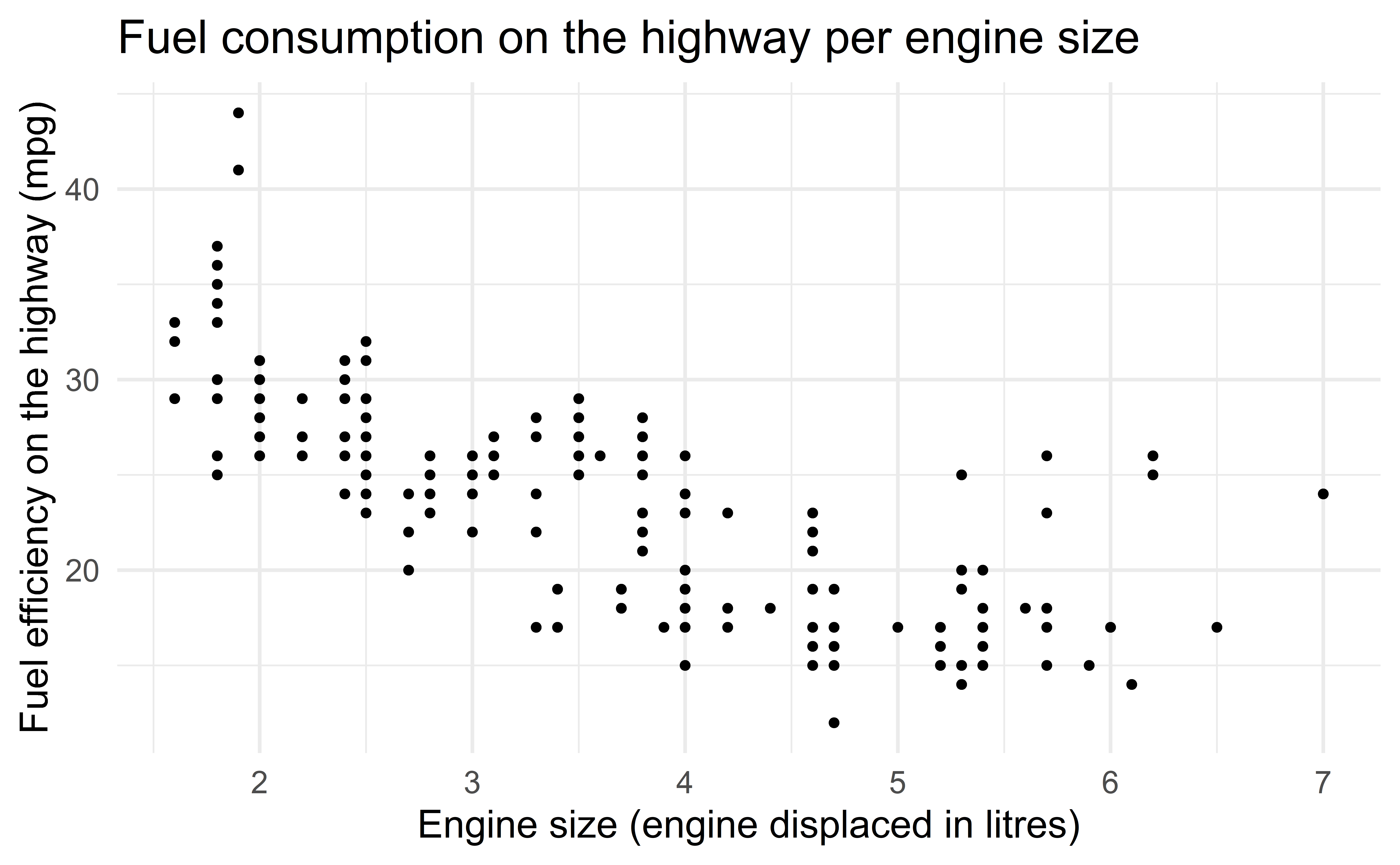
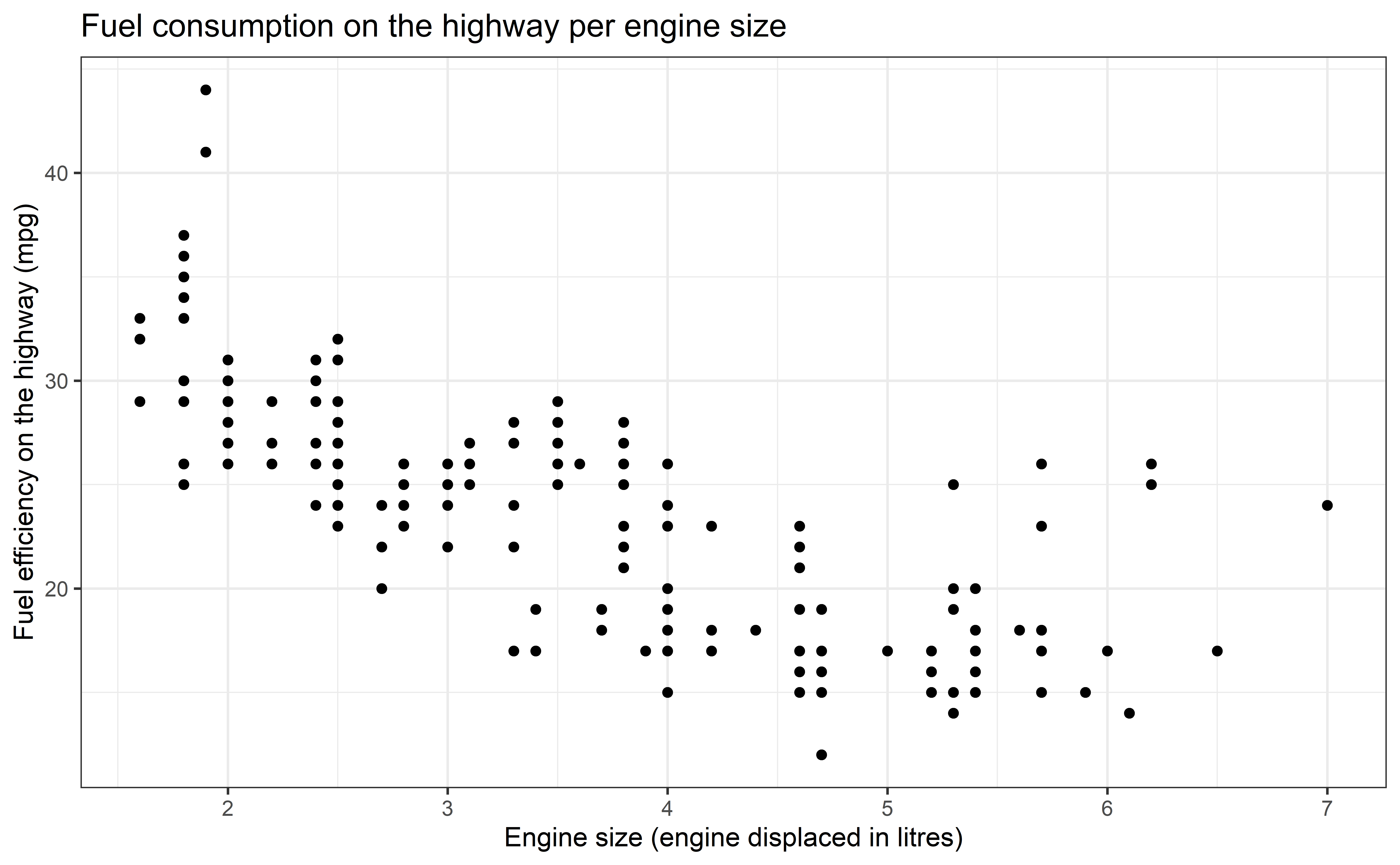
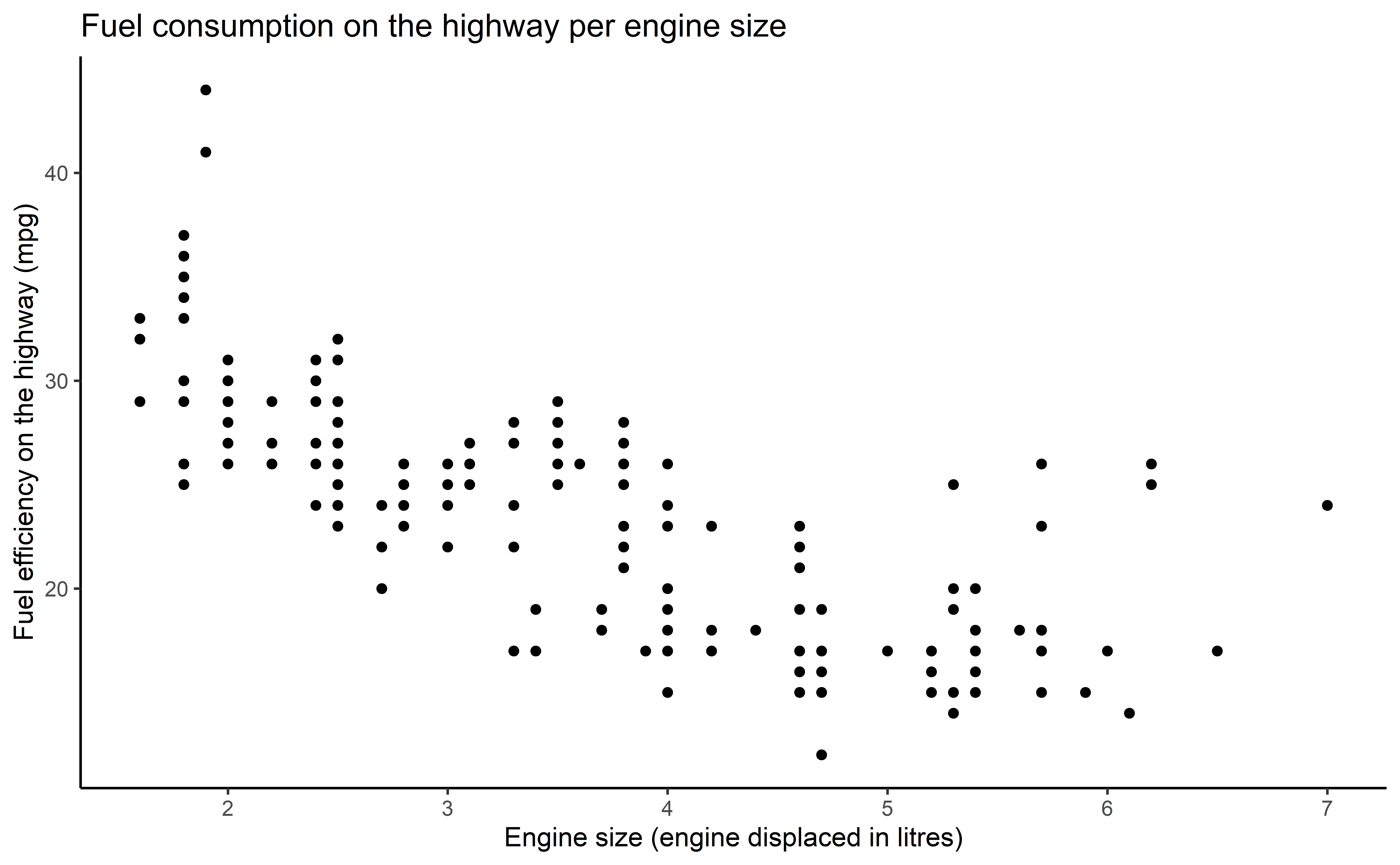
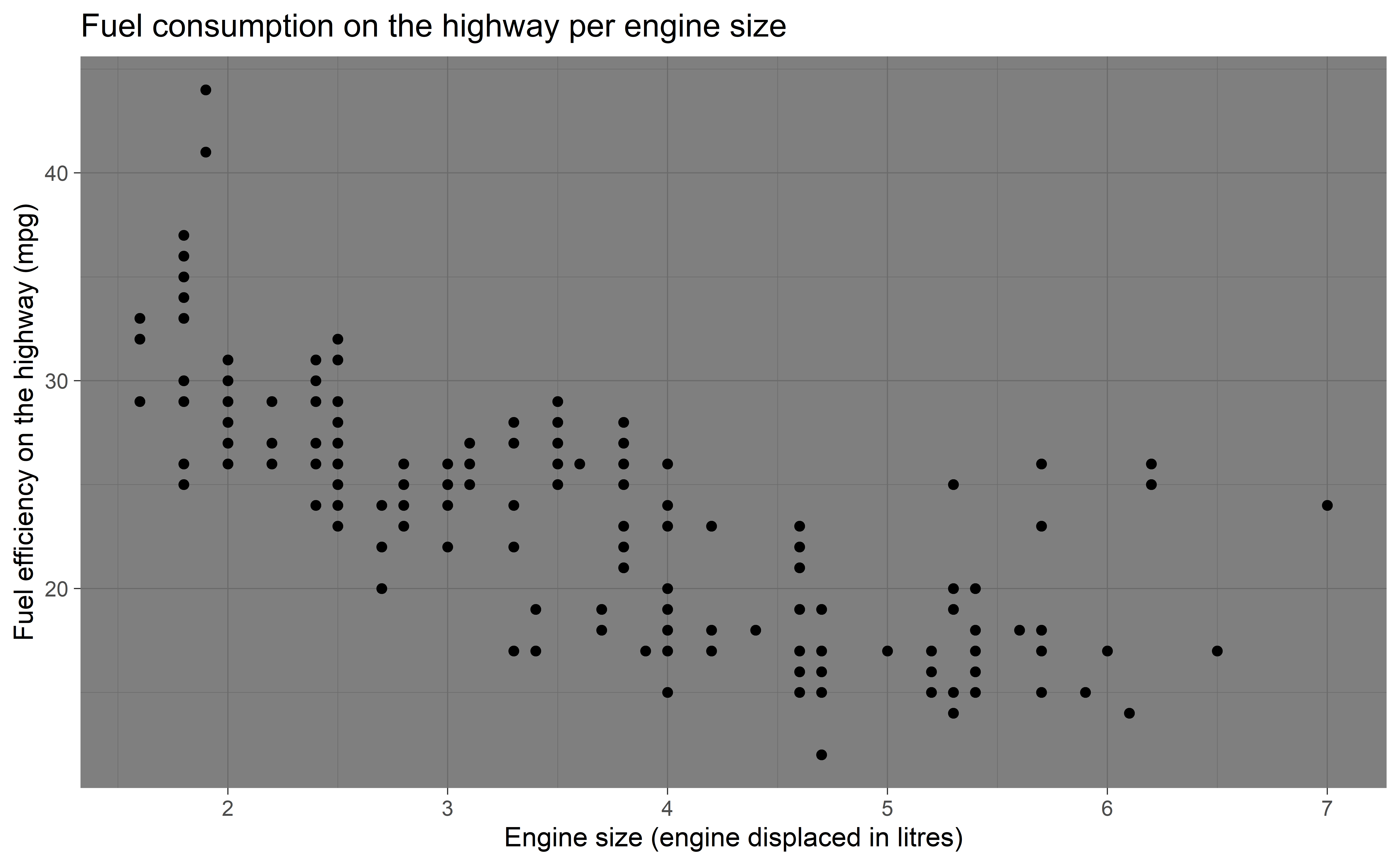
Figure title
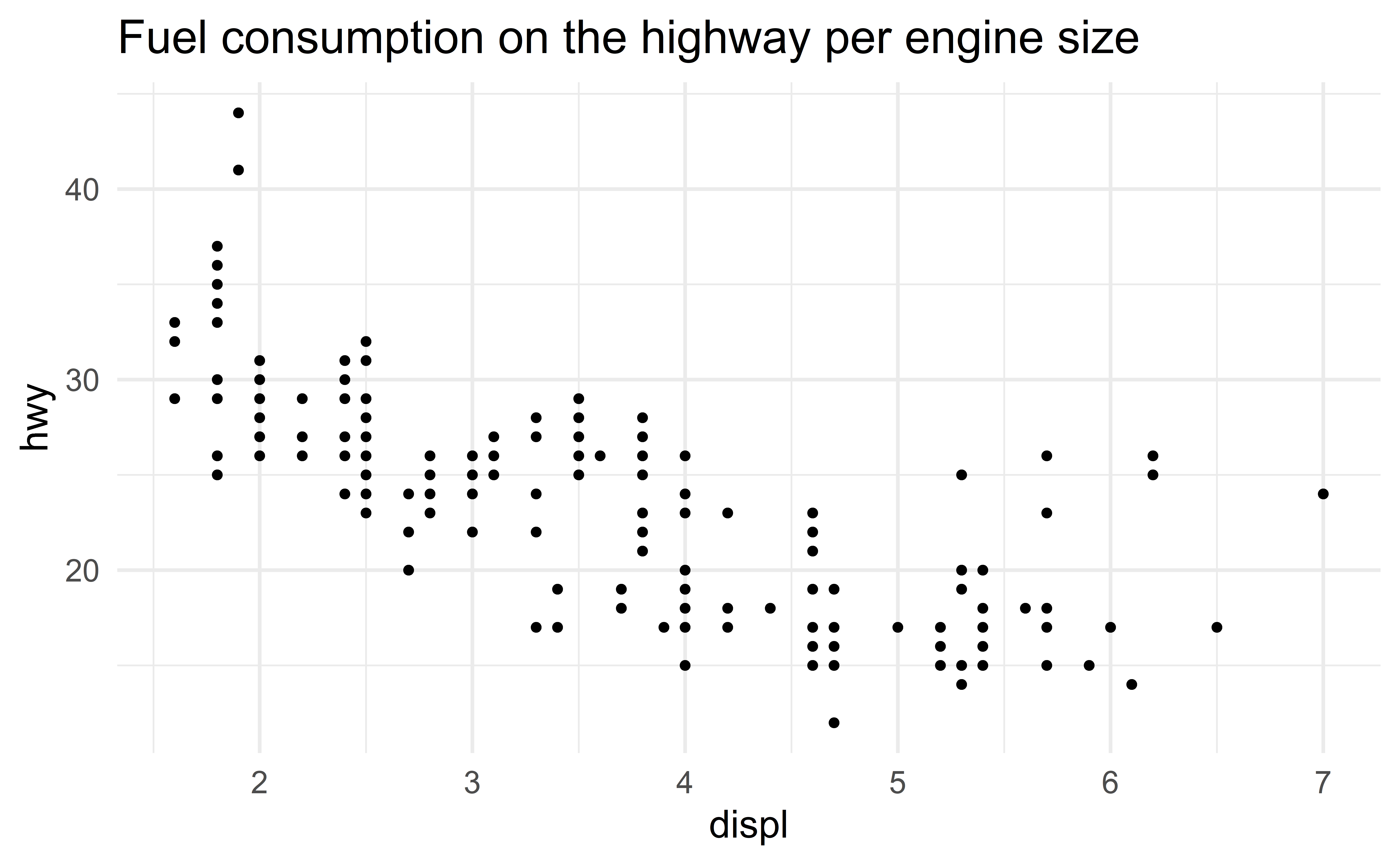
Axis labels
Recap
- Histogram, scatterplot, boxplot
- Average, median, variance, sd and IQR; robustness
- Frequency, contigency and proportion tables
- Barplot, mosaic plot
- Effective communication: well-edited figures, \(\ge3\) variables (symbols, colors, facets), tell a story
- R for Data Science - chapters 3 and 7
“The simple graph has brought more information to the data analyst’s mind than any other device.” — John Tukey
![]()